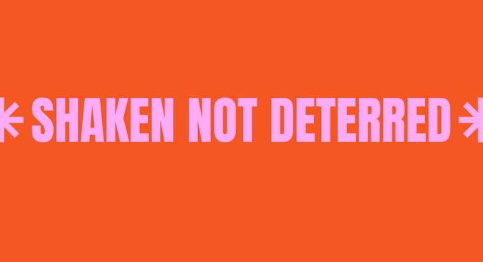
THE REDUNDANTS
Brand design In 2022, we observed a record number of people made redundant in all sectors and industries, unfortunately, there is no tool to help people to go through the process of redundancy smoothly. That's how "The Redundants" was born. The Redundants is the first free resource website to help people navigate through the process of redundancy. This website empowers redundant people with tools and resources such as podcasts, government resources by world region, book recommendations, networking websites, financial and mental health advice. The brand identity includes logos, color palette, fonts, icons, and social media posts. You can find The Redundants' website here: https://www.theredundants.com/
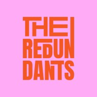
Logo: the principal idea was the building blocks, as this website is community focused with free resources, the letters interlock with each other to symbolize the community and resources built around this delicate subject. The benefit of this logo is that it can be modulable and evolutive.
Primary logo: it is used all the time in print and digital with primary colors of the color palette.
Secondary logo: it is used when the logo has to be super small like for social networks profile pics.
Primary font: Anton Regular is used mainly for titles, subtitles or to emphasize a quote, for example.
Secondary font: Roc Grotesk is used for body text in print and digital.
Icons: the icons were created to visualize all the subjects the website is covering: community, podcasts, mental health, financial advice, government resources, networking, books etc
Project Tags
Companies
The Redundants
- Education & Research